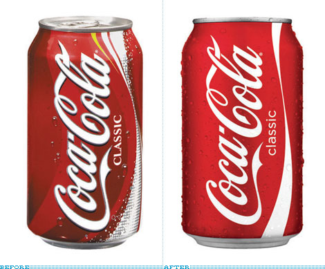
I’m as interested in design as the next guy, but check out this article concerning the modest revisions to the Coke can. It isn’t the article so much as the pages and pages of impassioned commenting that is so striking.
I’m as interested in design as the next guy, but check out this article concerning the modest revisions to the Coke can. It isn’t the article so much as the pages and pages of impassioned commenting that is so striking.

Jordan Hoffman is a New York-based writer and film critic working for The Guardian, Vanity Fair, Thrillist, Times of Israel, NY Daily News and elsewhere.
He is the host of ENGAGE: The Official Star Trek Podcast, a member of the New York Film Critics Circle and challenges you to a game of backgammon.


Perhaps you’re underestimating the amount of BS that goes into these design decisions, especially for a brand as big as coke. I assure you that this took a year to design, was “weighed in” on by hundreds of executives who have to justify their existence by having an opinion on this. Then it probably was tested (along with other designs) in innumerable focus groups, where 14 year old boys tell you they want more swooshes and bubbles and flourishes. It’s amazing this stuff doesn’t end up looking like a myspace page. That the designers were able to get something this simple and clean through all that is amazing. Plus it’s really pretty.